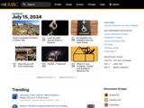
Unified Apps Menu and Improved Spotlights Area
In an effort to streamline user experience and improve accessibility, myUMBC has merged the Notifications, Mail, Blackboard, and Calendar menus into a single, consolidated Apps menu. This change aims to reduce the number of clicks required to access these essential tools, making navigation more efficient for users. Additionally, by simplifying the notifications, the menu is now less noisy, making it more obvious when there is something that requires immediate attention.
In another update, myUMBC has revamped the Spotlights area. The traditional slideshow format has been replaced with a grid display featuring six stories at once. This new layout allows users to scan all highlighted stories more quickly and efficiently, ensuring that important updates and information are readily accessible at a glance.
Both updates are part of a broader series of enhancements planned for myUMBC over the next year. These improvements focus on usability, accessibility, and updating core functionality. By integrating these menus and enhancing the Spotlights area, myUMBC seeks to be more intuitive and user-friendly.
These changes reflect our commitment to continuously evolving its platform to meet the needs of its community, ensuring a seamless and efficient user experience. The unified Apps menu and the new Spotlights grid are just the beginning of the enhancements users can expect as myUMBC rolls out further updates aimed at improving the overall functionality and accessibility of the platform.
For a preview of upcoming changes, check out our myUMBC Preview.
Note: This post was updated to reflect an update on 7/16 that merged the Apps and Notifications menus.
Posted: July 15, 2024, 8:21 AM
