Changes to navigation and notifications
We launched the updated myUMBC homepage experience this August and overall the responses were positive with regard to the updated look and feel and community focus. However, it was also obvious that we made some missteps in our redesign, notably around the notification list on the left of the homepage and the visibility of the main navigation links.
Although we hate making dramatic changes to myUMBC because of the disruption they cause to your workflow, we feel it is import to correct these mistakes quickly because of the frustration they’re causing.
Main Navigation Changes
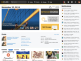
We’re moving the main navigation links into a single black bar across the top. This bar will contain Search, links to the major sections of myUMBC, as well as the links to Mail, Blackboard, etc. This should put these links in a more familiar place for users of past versions of myUMBC and be more obvious overall for all users.
Notification Changes
When we redesigned the homepage to focus more on community events and updates we were worried about people losing touch with the updates from their groups. The notifications menu in the top right let you see the latest updates from your groups but it was hidden by default, so we decided to show a summary of your updates on the left hand side of the homepage next to the navigation links. This summary showed you the number of unread updates from your groups but because, realistically, people don't read everything they get from every group, what ended up happening was a bloat of notifications. This resulted in an increasing notification count that was at best annoying and at worst anxiety inducing.
Since we’re removing the main navigation links from the left-hand side, we decided to go ahead and remove the entire left side of the homepage and use the space made available to show the notification menu by default. We think this has two key advantages over the previous design:
- You can immediately see the subject of your most recent notifications to know if something is interesting or not — versus just the name of the sending group and a number of unread.
- Critical updates like Alerts are seen immediately upon logging in rather than hidden under a number or a dropdown.
The notification list will be open by default on large screen browsers only and only on the homepage of myUMBC. We are also exploring redesigning this notification list to work more like notifications on your phone: grouping of notifications, easier marking as read, and more interactive.
Updated Interface
Here is a screenshot of the new interface:
We apologize for making dramatic changes like this mid-academic year, but we feel these improvements are warranted.
As always, feel free to leave a comment or reach out to me directly if you have any questions for feedback.
Posted: December 7, 2018, 10:22 AM